EditableTable
EditableTable
With Angular Editable Bootstrap Table, you can add and remove rows and change text and information within cells. In-place editing on your website - based on JavaScript - is now easier and quicker.
Examples
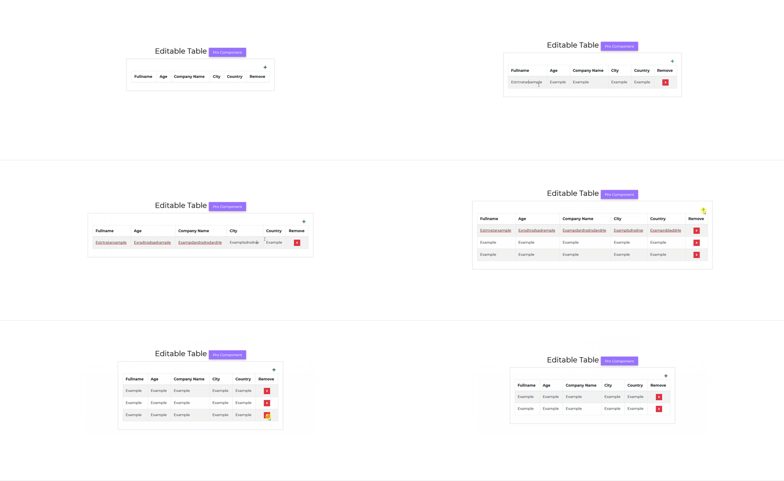
Default EditableTable example.
html
<CDBCard><CDBCardBody><CDBEditableTable [striped]=true [bordered]=true [data]='data' [columns]='columns' ></CDBEditableTable></CDBCardBody></CDBCard>
typescript
import { Component, OnInit } from '@angular/core';@Component({selector: 'app-editable-table',templateUrl: './editable-table.component.html',styleUrls: ['./editable-table.component.scss'],})export class EditableTableComponent implements OnInit {columns = ['Fullname', 'Age', 'Company Name', 'City', 'Country'];data = [['Guerra Cortez', 45, 'Insectus', 'San Francisco', 'USA'],['Elisa Gallagher', 31, 'Portica', 'London', 'United Kingdom'],['Aurelia Vega', 30, 'Deepends', 'Madrid', 'Spain'],['Guadalupe House', 26, 'Isotronic', 'Berlin', 'Germany'],];constructor() {}ngOnInit(): void {}}
API
Here in this section you will find information about required modules and available inputs, outputs, methods and events of this component.
Contrast EditableTable Bootstrap Modules used
import {EditabletableModule } from 'cdbangular';
API Reference: Contrast EditableTable Bootstrap Inputs
The table below shows the possible input of the EditableTable component.
| Name | Type | Default | Description | Example |
|---|---|---|---|---|
| class | String | Adds custom classes | class="myClass" | |
| autoWidth | Boolean | false | Adds w-auto to the className | autoWidth=true |
| bordered | Boolean | false | Adds borders on all sides of the table and cells. | bordered=true |
| borderless | Boolean | false | Removes borders on all sides of the table and cells. | borderless=true |
| data | Array | Binds your data into the component. | data = ['Aurelia Vega', 30, 'Depends'] | |
| columns | Array | Specify headers and number of columns | columns=['Person Name', 'Age', 'Company Name'] | |
| hover | Boolean | false | Enables a hover state on table rows within a table body. | hover=true |
| responsive | Boolean | Makes table responsive across all viewports | responsive=true | |
| responsiveSm | Boolean | Makes table responsive up to the small breakpoint | responsiveSm=true | |
| responsiveMd | Boolean | Makes table responsive up to the medium breakpoint | responsiveMd=true | |
| responsiveLg | Boolean | Makes table responsive up to the large breakpoint | responsiveLg=true | |
| responsiveXl | Boolean | Makes table responsive up to the extra large breakpoint | responsiveXl=true | |
| hover | Boolean | false | Enables a hover state on table rows within a table body. | hover=true |
| small | Boolean | false | Makes tables more compact by cutting cell padding in half. | small=true |
| striped | Boolean | false | Adds zebra-striping to any table row within the table body. | striped=true |