Rating
Rating
Angular Bootstrap 5-star rating plugin can be used to allow the users to share their opinion about the product, documentation page, photo and more.
Visit API by scrolling down for all available inputs.
Examples
Default Rating example.
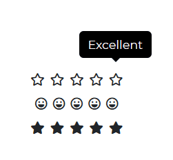
html
<CDBRating [iconRegular]=true></CDBRating><CDBRating [iconFaces]=true fillClass='black-text' [iconRegular]=true></CDBRating><CDBRating [feedback]=true></CDBRating>
API
Here in this section you will find information about required modules and available inputs, outputs, methods and events of this component.
Contrast Rating Bootstrap Modules used
import {RatingModule } from 'cdbangular';
API Reference: Contrast Rating Inputs
The table below shows the possible input of the Rating component.
| Name | Type | Default | Description | Example |
|---|---|---|---|---|
| containerClass | String | Adds custom classes to the container | containerClass="myClass" | |
| data | Array | [{tooltip: 'Very Bad'}, {tooltip: 'Poor'}, {tooltip: 'Ok'}, {tooltip: 'Good'},{tooltip: 'Excellent'}] | Sets custom data of icon property. | data=[{tooltip: 'Very Bad'}, {tooltip: 'Poor'}, {tooltip: 'Ok'}, {tooltip: 'Good'},{tooltip: 'Excellent'}] |
| feedback | Boolean | false | If set to true, clicking a star will trigger a popover with a textarea | feedback=true |
| fillClass | String | fiveStars | Sets custom classes for filled icons | fillClass="red-text" |
| iconClass | String | Sets default icon's classes | iconClass="blue-text" | |
| iconFaces | Boolean | false | Changes icon star for icon face | iconFaces=true |
| iconSize | String | 1x | Sets size of icons | iconSize="2x" |
| iconRegular | Boolean | false | Sets regular style of icons | iconRegular=true |
| submitHandler | function | Returns feedback form value | summitHandler={handleSubmit} |