Radio
Radio
Angular Bootstrap Radio button is a component used for allowing a user to make a single choice among many options, while
Checkboxes are for selecting multiple options.
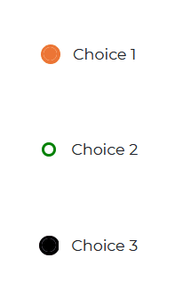
Single Radio Example
html
<CDBRadio value="Choice 1" fill="#eb7434" colorfill="#eb7434"></CDBRadio><CDBRadio value="Choice 2" fill="green" colorfill="red"></CDBRadio><CDBRadio value="Choice 3" fill="#000000" colorfill="#000000"></CDBRadio>
CDBRadio
html
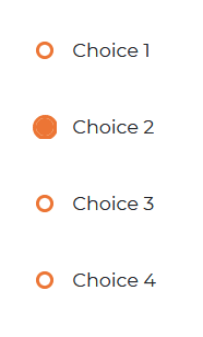
<CDBRadioGroup fill="#eb7434" colorfill="#eb7434" [answers]="['Choice 1', 'Choice 2' , 'Choice 3' , 'Choice 4' ]"></CDBRadioGroup>
API
Here in this section you will find information about required modules and available inputs, outputs, methods and events of this component.
Contrast Radio Bootstrap Modules used
import {RadioModule } from 'cdbangular';
API Reference: Contrast Radio Inputs
The table below shows the possible input of the Radio component.
| Name | Type | Default | Description | Example |
|---|---|---|---|---|
| class | String | Adds custom classes | class="myClass" | |
| fill | String | #455ff5 | Sets the color of the unselected radio button | fill="#000000" |
| colorfill | String | Sets the color of the selected radio button | colorFill="#000000" | |
| value | String | The value of the input element | value="Choice1" |
API Reference: Contrast Radio Group Inputs
The table below shows the configuration options of the CDBRadioGroup component.
| Name | Type | Default | Description | Example |
|---|---|---|---|---|
| className | String | Adds custom classes | class="myClass" | |
| fill | String | #455ff5 | Sets the color of the unselected radio button | fill="#000000" |
| colorfill | String | Sets the color of the selected radio button | colorFill="#000000" | |
| answers | Array | [] | The list of values of the input element | answers=[choice1, choice2, choice3] |