Pane
Pane
Angular Bootstrap Pane is a component used in displaying information like a card. It is typically used in Chat UIs and so on
Pane with Location Marker
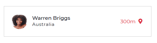
Pane with location.
html
<CDBPanel class="pan"><CDBPane><CDBPaneImage size="md"src="https://media.istockphoto.com/photos/beautiful-woman-wearing-brown-curly-hairstyle-picture-id495006065?s=170x170" ></CDBPaneImage><div class="ml-3"><CDBPanelTitle>Warren Briggs</CDBPanelTitle><CDBPanelText small>Australia</CDBPanelText></div><p class="ml-auto mb-0 text-danger">300m<CDBIcon [fas]=true icon="map-marker-alt" ></CDBIcon></p></CDBPane></CDBPanel>
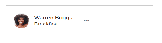
Pane with Dropdown
html
<CDBPanel class="pan" ><CDBPane><CDBPaneImage size="md"src="https://media.istockphoto.com/photos/beautiful-woman-wearing-brown-curly-hairstyle-picture-id495006065?s=170x170" ></CDBPaneImage><div class="ml-3"><CDBPanelTitle>Warren Briggs</CDBPanelTitle><CDBPanelText small>Breakfast</CDBPanelText></div><CDBDropDown cdbDropdown class="ml-auto"><CDBDropDownToggle color="white"><CDBIcon class="text-muted" [fas]=true icon="ellipsis-h" ></CDBIcon></CDBDropDownToggle><CDBDropDownMenu><CDBDropDownItem [disabled]='true'>Edit Profile</CDBDropDownItem><CDBDropDownItem [divider]='true' ></CDBDropDownItem><CDBDropDownItem>Action 1</CDBDropDownItem><CDBDropDownItem>Action 2</CDBDropDownItem></CDBDropDownMenu></CDBDropDown></CDBPane></CDBPanel>
API
Here in this section you will find information about required modules and available inputs, outputs, methods and events of this component.
Contrast Pane Bootstrap Modules used
import {PaneModule } from 'cdbangular';
API Reference: Contrast Pane Inputs
The table below shows the possible input of the Pane component.
| Name | Type | Default | Description | Example |
|---|---|---|---|---|
| class | String | Adds custom classes | class="myClass" |