Badges
Badges
Angular Bootstrap Badge component is a small count and labeling component.
Examples
Badges scale to match the size of the immediate parent element by using relative font sizing and em units.

html
<CDBBadge color="primary">Primary</CDBBadge><CDBBadge color="secondary">Secondary Badge</CDBBadge><CDBBadge color="success">Success Badge</CDBBadge><CDBBadge color="danger">Danger Badge</CDBBadge><CDBBadge color="warning">Warning Badge</CDBBadge><CDBBadge color="info">Info Badge</CDBBadge><CDBBadge color="dark">Dark Badge</CDBBadge>
Pill Badges
Set the borderType property to pill to make badges more rounded.
html
<CDBBadge color="primary" borderType="pill">Primary</CDBBadge><CDBBadge color="secondary" borderType="pill">Secondary Badge</CDBBadge><CDBBadge color="success" borderType="pill">Success Badge</CDBBadge><CDBBadge color="danger" borderType="pill">Danger Badge</CDBBadge><CDBBadge color="warning" borderType="pill">Warning Badge</CDBBadge><CDBBadge color="info" borderType="pill">Info Badge</CDBBadge><CDBBadge color="dark" borderType="pill">Dark Badge</CDBBadge>
Contextual Variations
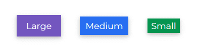
Add any of the below mentioned properties to change the appearance of a badge.
html
<CDBBadge color="secondary" size="large">Large</CDBBadge><CDBBadge color="primary">Medium</CDBBadge><CDBBadge color="success" size="small">Small</CDBBadge>
Flat Badges
Add the flat property to change the appearance of a badge.

html
<CDBBadge color="primary" flat>Flat Primary</CDBBadge><CDBBadge color="secondary" flat>Flat Secondary</CDBBadge><CDBBadge color="success" flat>Flat Success</CDBBadge><CDBBadge color="danger" flat>Flat Danger</CDBBadge><CDBBadge color="warning" flat>Flat Warning</CDBBadge><CDBBadge color="info" flat>Flat Info</CDBBadge><CDBBadge color="dark" flat>Flat Dark</CDBBadge>
Badges with Icons
Use CDBIcon to add icons to a badge.

html
<CDBBadge color="secondary"><CDBIcon fab icon="facebook-f" /></CDBBadge><CDBBadge color="primary"><CDBIcon fab icon="instagram" /></CDBBadge><CDBBadge color="success"><CDBIcon fab icon="snapchat-ghost" /></CDBBadge><CDBBadge color="info"><CDBIcon icon="anchor" /></CDBBadge><CDBBadge color="warning"><CDBIcon far icon="sun" /></CDBBadge><CDBBadge color="danger"><CDBIcon icon="battery-three-quarters" /></CDBBadge><CDBBadge color="success"><CDBIcon fab icon="btc" size="large" /></CDBBadge><CDBBadge borderType="pill" color="secondary" size="large"><CDBIcon icon="heart" /></CDBBadge><CDBBadge borderType="pill" color="danger"><CDBIcon fab icon="apple" /></CDBBadge><CDBBadge borderType="pill" color="primary" size="large"><CDBIcon icon="users" /></CDBBadge>
Rounded Badges with Icons
Set the borderType property to pill to make badges more rounded.
Use CDBIcon to add icons to a badge.
html
<CDBBadge color="secondary"><CDBIcon fab icon="facebook-f" /></CDBBadge><CDBBadge color="primary"><CDBIcon fab icon="instagram" /></CDBBadge><CDBBadge color="success"><CDBIcon fab icon="snapchat-ghost" /></CDBBadge><CDBBadge color="info"><CDBIcon icon="anchor" /></CDBBadge><CDBBadge color="warning"><CDBIcon far icon="sun" /></CDBBadge><CDBBadge color="danger"><CDBIcon icon="battery-three-quarters" /></CDBBadge><CDBBadge color="success"><CDBIcon fab icon="btc" size="large" /></CDBBadge><CDBBadge borderType="pill" color="secondary" size="large"><CDBIcon icon="heart" /></CDBBadge><CDBBadge borderType="pill" color="danger"><CDBIcon fab icon="apple" /></CDBBadge><CDBBadge borderType="pill" color="primary" size="large"><CDBIcon icon="users" /></CDBBadge>
API
Here in this section you will find information about required modules and available inputs, outputs, methods and events of this component.
Contrast Badge Bootstrap Modules used
import {BadgeModule } from 'cdbangular';
API Reference: Contrast Badge Bootstrap Inputs
The table below shows the possible input of the Badge component.
| Name | Type | Default | Description | Example |
|---|---|---|---|---|
| className | String | Adds custom classes | class="myClass" | |
| color | String | primary | Determines badge color, accepts CDB predefined color classes: primary secondary success danger warning info light dark | [color]="primary" |
| flat | Boolean | false | Adds flat effect to badge | color="primary" flat="true" |
| size | String | medium | Determines badge size, available values: small medium large, medium by default | color="secondary" size="large" |
| borderType | String | box | Determines the corners effect of the badge | color="secondary" borderType="pill" |
| tag | String | span | Changes default tag | color="secondary" tag="span" |