Button
Button
Angular Bootstrap Buttons are components that trigger wanted user interactions. They are easy to customize in terms of their size, shape and color.
Examples of Basic Contrast Styles For Buttons
Bootstrap includes several predefined button styles, each serving its own semantic purpose, with a few extras thrown in for more control.

html
<CDBBtn color="primary">Primary</CDBBtn><CDBBtn color="secondary">Secondary</CDBBtn><CDBBtn color="success">Success</CDBBtn><CDBBtn color="danger">Danger</CDBBtn><CDBBtn color="dark">Dark</CDBBtn><CDBBtn color="warning">Warning</CDBBtn><CDBBtn color="info">Info</CDBBtn><CDBBtn color="white">White</CDBBtn><CDBBtn color="light">Light</CDBBtn>
Circular Buttons

html
<CDBBtn color="primary" [circle]=true>Primary</CDBBtn><CDBBtn color="secondary" [circle]=true>Secondary</CDBBtn><CDBBtn color="success" [circle]=true>Success</CDBBtn><CDBBtn color="danger" [circle]=true>Danger</CDBBtn><CDBBtn color="dark" [circle]=true>Dark</CDBBtn><CDBBtn color="warning" [circle]=true>Warning</CDBBtn><CDBBtn color="info" [circle]=true>Info</CDBBtn><CDBBtn color="white" [circle]=true>White</CDBBtn><CDBBtn color="light" [circle]=true>Light</CDBBtn>
Outline Buttons

html
<CDBBtn color="primary" [outline]=true>Primary</CDBBtn><CDBBtn color="secondary" [outline]=true>Secondary</CDBBtn><CDBBtn color="success" [outline]=true>Success</CDBBtn><CDBBtn color="danger" [outline]=true>Danger</CDBBtn><CDBBtn color="dark" [outline]=true>Dark</CDBBtn><CDBBtn color="warning" [outline]=true>Warning</CDBBtn><CDBBtn color="info" [outline]=true>Info</CDBBtn>
Circular Outline Buttons

html
<CDBBtn color="primary" [circle]=true [outline]=true>Primary</CDBBtn><CDBBtn color="secondary" [circle]=true [outline]=true>Secondary</CDBBtn><CDBBtn color="success" [circle]=true [outline]=true>Success</CDBBtn><CDBBtn color="danger" [circle]=true [outline]=true>Danger</CDBBtn><CDBBtn color="dark" [circle]=true [outline]=true>Dark</CDBBtn><CDBBtn color="warning" [circle]=true [outline]=true>Warning</CDBBtn><CDBBtn color="info" [circle]=true [outline]=true>Info</CDBBtn>
Flat Buttons

html
<CDBBtn color="primary" [flat]=true>Primary</CDBBtn><CDBBtn color="secondary" [flat]=true>Secondary</CDBBtn><CDBBtn color="success" [flat]=true>Success</CDBBtn><CDBBtn color="danger" [flat]=true>Danger</CDBBtn><CDBBtn color="dark" [flat]=true>Dark</CDBBtn><CDBBtn color="warning" [flat]=true>Warning</CDBBtn><CDBBtn color="info" [flat]=true>Info</CDBBtn><CDBBtn color="white" [flat]=true>White</CDBBtn><CDBBtn color="light" [flat]=true>Light</CDBBtn>
Label at the side

html
<CDBBtn color="primary" label="right">Primary</CDBBtn><CDBBtn color="secondary" label="right">Secondary</CDBBtn><CDBBtn color="success" label="right">Success</CDBBtn><CDBBtn color="danger">Danger</CDBBtn><CDBBtn color="dark" label="left">Dark</CDBBtn><CDBBtn color="warning" label="left">Warning</CDBBtn><CDBBtn color="info" label="left">Info</CDBBtn><CDBBtn color="white" label="left">White</CDBBtn><CDBBtn color="light" label="left">Light</CDBBtn>
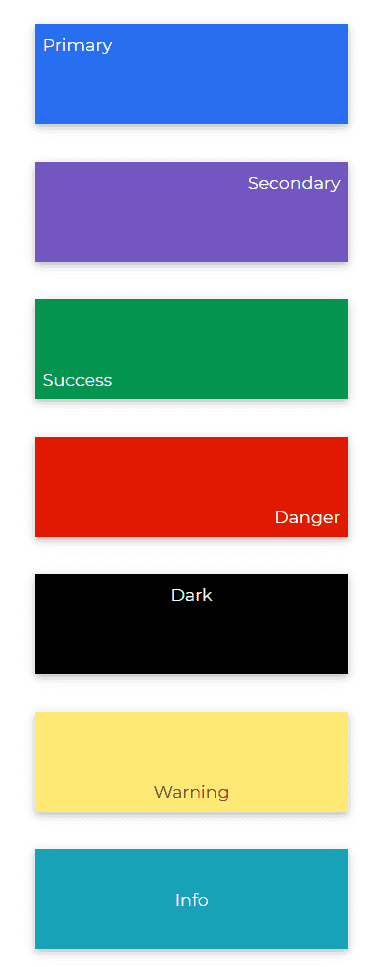
Large Button ending with Text
html
<CDBBtn style="width: 250px; height: 80px" color="primary" endingText="top-left">Primary</CDBBtn><CDBBtn style="width: 250px; height: 80px" color="secondary" endingText="top-right">Secondary</CDBBtn><CDBBtn style="width: 250px; height: 80px" color="success" endingText="bottom-left">Success</CDBBtn><CDBBtn style="width: 250px; height: 80px" color="danger" endingText="bottom-right">Danger</CDBBtn><CDBBtn style="width: 250px; height: 80px" color="dark" endingText="top">Dark</CDBBtn><CDBBtn style="width: 250px; height: 80px" color="warning" endingText="bottom">Warning</CDBBtn><CDBBtn style="width: 250px; height: 80px" color="info" endingText="center">Info</CDBBtn><CDBBtn style="width: 250px; height: 80px" color="white" endingText="center">White</CDBBtn><CDBBtn style="width: 250px; height: 80px" color="light" endingText="center">Light</CDBBtn>
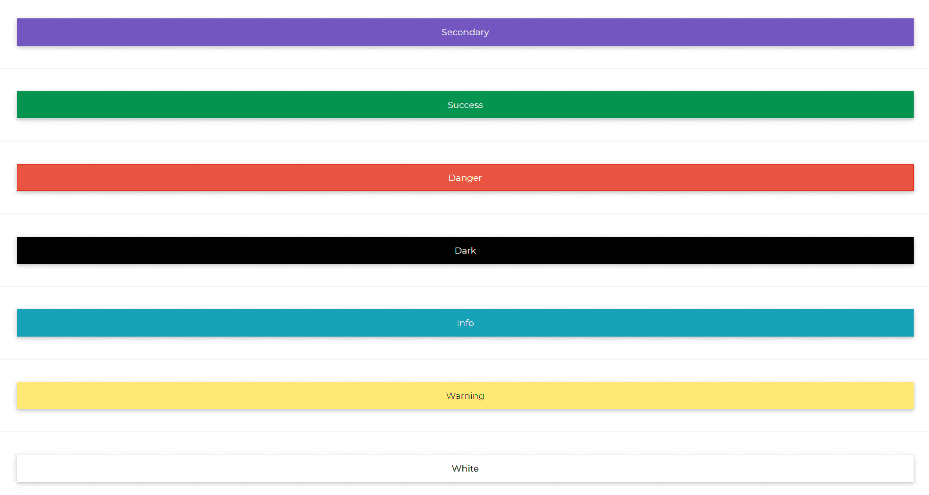
Block Button
html
<CDBBtn color="primary" [block]=true>Primary</CDBBtn><CDBBtn color="secondary" [block]=true>Secondary</CDBBtn><CDBBtn color="success" [block]=true>Success</CDBBtn><CDBBtn color="danger" [block]=true>Danger</CDBBtn><CDBBtn color="dark" [block]=true>Dark</CDBBtn><CDBBtn color="info" [block]=true>Info</CDBBtn><CDBBtn color="warning" [block]=true>Warning</CDBBtn><CDBBtn color="white" [block]=true>White</CDBBtn><CDBBtn color="light" [block]=true>Light</CDBBtn>
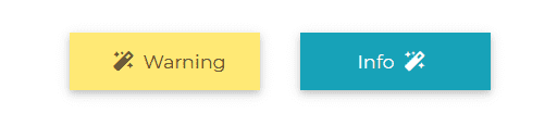
Buttons with Icons
html
<CDBBtn color="warning"><CDBIcon icon="magic" class="ml-1"></CDBIcon>Warning</CDBBtn><CDBBtn color="info">Info<CDBIcon icon="magic" class="mr-1"></CDBIcon></CDBBtn>
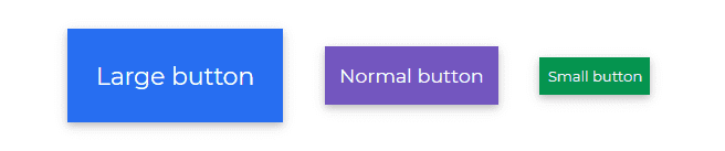
Button Sizes
html
<CDBBtn color="primary" size="xl">Extra Large button</CDBBtn><CDBBtn color="secondary" size="large">Large button</CDBBtn><CDBBtn color="warning">Normal button</CDBBtn><CDBBtn color="success" size="small">Small button</CDBBtn>
Disabled Buttons
html
<CDBBtn color="secondary" [disabled]=true>Disabled Button</CDBBtn>
API
Here in this section you will find information about required modules and available inputs, outputs, methods and events of this component.
Contrast Button Bootstrap Modules used
import {ButtonModule } from 'cdbangular';
API Reference: Contrast Button Bootstrap Inputs
The table below shows the possible input of the Button component.
| Name | Type | Default | Description | Example |
|---|---|---|---|---|
| action | Boolean | false | Adds btn-action class, works with Cards | action=true |
| active | Boolean | false | Adds active class | active=true |
| block | Boolean | false | Create block level buttons | block=true |
| circle | Boolean | false | Adds btn-circle class, works with stepper | circle=true |
| class | String | class="custom-class" | ||
| color | String | primary | Determines button color, accepts CDB predefined color classes | color="secondary" |
| disabled | Boolean | false | Disables button from being clicked | disabled=true |
| download | String | Adds download attribute with provided url | download="https://link_to_your_file.com" | |
| endingText | String | Positions the button text in one of the selected positions. These positions include top-left, top-right, bottom-left, bottom-right, top, bottom, center. | endingText="center" | |
| flat | Boolean | false | Adds flat effect to button. That is button without background and borders | flat=true |
| innerRef | function or String | Allows to pass Ref string, which will attach to rendered button or a DOM element | innerRef="buttonRef" | |
| label | String | Positions button text left or right. | label="left" | |
| onClick | function | Will call a function when the button is clicked | onClick={yourFunction} | |
| role | String | Adds role attribute to button | role="...." | |
| size | String | medium | Determines button size, available values: [small, large, xl]. | size="large" |
| social | String | Adds a social media icon. | social="fb" | |
| target | String | _self | If used as link, sets target attribute | href="..." target="_blank" |
| type | String | button | Adds type attribute to button | type="submit" |