Multiselect
Multiselect
Angular Bootstrap Multiselect is a form control, that after the click displays a collapsable list of multiple values which can be used in forms, menus or surveys.
Multiselect enables you to use ↑ and ↓ arrow keys to navigate through options and use ↵ key to select required option.
Basic Multiselect
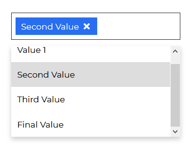
html
<CDBMultiselect [options]='option' selected="Value"></CDBMultiselect>
typescript
import { Component, OnInit } from '@angular/core';@Component({selector: 'app-multiselect',templateUrl: './multiselect.component.html',styleUrls: ['./multiselect.component.scss'],})export class MultiselectComponent implements OnInit {option = [{text: 'Value 1',showing: true,},{text: 'Second Value',showing: true,},{text: 'Third Value',showing: true,},{text: 'Final Value',showing: true,},];selectOptions = [{text: 'Value 1',showing: true,},{text: 'Second Value',showing: true,},{text: 'Third Value',showing: true,},{text: 'Final Value',showing: true,},];constructor() {}ngOnInit(): void {}}
Multiselect with Search
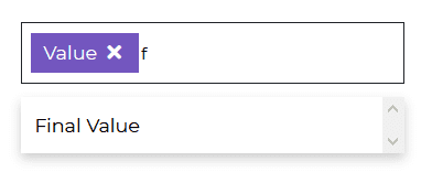
html
<CDBMultiselect color="secondary" [search]=true [options]='option' selected="Value"></CDBMultiselect>
typescript
import { Component, OnInit } from '@angular/core';@Component({selector: 'app-multiselect',templateUrl: './multiselect.component.html',styleUrls: ['./multiselect.component.scss'],})export class MultiselectComponent implements OnInit {option = [{text: 'Value 1',showing: true,},{text: 'Second Value',showing: true,},{text: 'Third Value',showing: true,},{text: 'Final Value',showing: true,},];selectOptions = [{text: 'Value 1',showing: true,},{text: 'Second Value',showing: true,},{text: 'Third Value',showing: true,},{text: 'Final Value',showing: true,},];constructor() {}ngOnInit(): void {}}
Multiselect with Submit Option
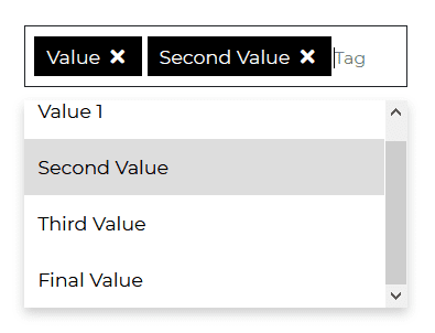
html
<CDBMultiselect color="dark" [submit]=true [options]='option' selected="Value" ></CDBMultiselect>
typescript
import { Component, OnInit } from '@angular/core';@Component({selector: 'app-multiselect',templateUrl: './multiselect.component.html',styleUrls: ['./multiselect.component.scss'],})export class MultiselectComponent implements OnInit {option = [{text: 'Value 1',showing: true,},{text: 'Second Value',showing: true,},{text: 'Third Value',showing: true,},{text: 'Final Value',showing: true,},];selectOptions = [{text: 'Value 1',showing: true,},{text: 'Second Value',showing: true,},{text: 'Third Value',showing: true,},{text: 'Final Value',showing: true,},];constructor() {}ngOnInit(): void {}}
Multiselect with Limited Options
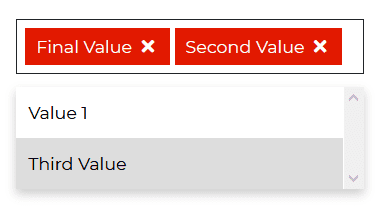
html
<CDBMultiselect color="danger" [limitedOptions]=true [options]='option' selected="Value" ></CDBMultiselect>
typescript
import { Component, OnInit } from '@angular/core';@Component({selector: 'app-multiselect',templateUrl: './multiselect.component.html',styleUrls: ['./multiselect.component.scss'],})export class MultiselectComponent implements OnInit {option = [{text: 'Value 1',showing: true,},{text: 'Second Value',showing: true,},{text: 'Third Value',showing: true,},{text: 'Final Value',showing: true,},];selectOptions = [{text: 'Value 1',showing: true,},{text: 'Second Value',showing: true,},{text: 'Third Value',showing: true,},{text: 'Final Value',showing: true,},];constructor() {}ngOnInit(): void {}}
API
Here in this section you will find information about required modules and available inputs, outputs, methods and events of this component.
Contrast Multiselect Bootstrap Modules used
import {MultiselectModule } from 'cdbangular';
API Reference: Contrast Multiselect Inputs
The table below shows the possible input of the Multiselect component.
| Name | Type | Default | Description | Example |
|---|---|---|---|---|
| class | String | Adds custom classes | class="myClass" | |
| search | Boolean | false | Search element will appear as the first child of select. | search=true |
| color | String | primary | Sets colorful hover effect on select options. | color="secondary" |
| options | array of objects | Sets options array as source of data. This property is used in alternative Select version. | [options]='option' | |
| selected | String | Set default select text content. | selected="choose_option" |