Slider
Slider
Angular Bootstrap Slider is an interactive component that lets the user swiftly slide through possible values spread on the desired range.
Its basic implementation is quite simple and does not require big blocks of code.
Examples of Angular Bootstrap slider use:
- Video progress bar
- Volume increase/decrease
- Enthusiasm-o-meter
Examples
Slider example.
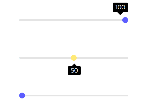
html
<CDBSlider style="max-width: 300px;margin: auto;"></CDBSlider><CDBSlider variant='slider-warning' tooltipPlacement="bottom"style="max-width: 300px;margin: auto; margin-top: 50px;"></CDBSlider><CDBSlider tooltip="auto" style="max-width: 300px;margin: auto; margin-top: 50px;"></CDBSlider>
API
Here in this section you will find information about required modules and available inputs, outputs, methods and events of this component.
Angular Bootstrap Slider Modules used
import {SliderModule } from 'cdbangular';
API Reference: Contrast Slider Inputs
The table below shows the possible input of the Slider component.
| Name | Type | Default | Description | Example |
|---|---|---|---|---|
| class | String | Adds custom classes | class="myClass" | |
| value | Number or String | Slider's value - useful for additional data binding and edge use-cases | value=49 | |
| disable | Boolean | false | Disables Slider component | [disabled] = false |
| min | Number | 0 | Sets the lowest Slider's value | min=10 |
| max | Number | 100 | Sets the highest Slider's value | max=70 |
| step | Number | 1 | Specifies the interval between valid values in a number-based input. | step=0.1 |
| size | String | Changes size of slider component. Choose from lg and sm | size="sm" | |
| variant | String | dark | Changes default slider color; available values: [blue, red, teal, dark-grey, dark, blue-grey, amber, purple] | variant="red" |
| onChange | function | Returns slider value, on onChange event | onChange=handleChange | |
| onAfterChange | function | executes a function after Change event | onAfterChange=handleAfterChange | |
| tooltip | String | Displays the current value of the slider. Can choose from auto, on or off | tooltip="on" | |
| tooltipPlacement | String | Selects where to place tooltip. Can choose from top or bottom | tooltipPlacement="top" | |
| tooltipLabel | function | Sets the label of the tooltip | tooltipLabel=yourFunction | |
| tooltipStyle | Object | Customize the style of the tooltip | tooltipStyle= color: "red" |