Input
Input
Angular Bootstrap Input is a special field which is used in order to receive data from the user. Used mostly in a variety of web-based forms. You can use material design version or default bootstrap style.
Default Input Types
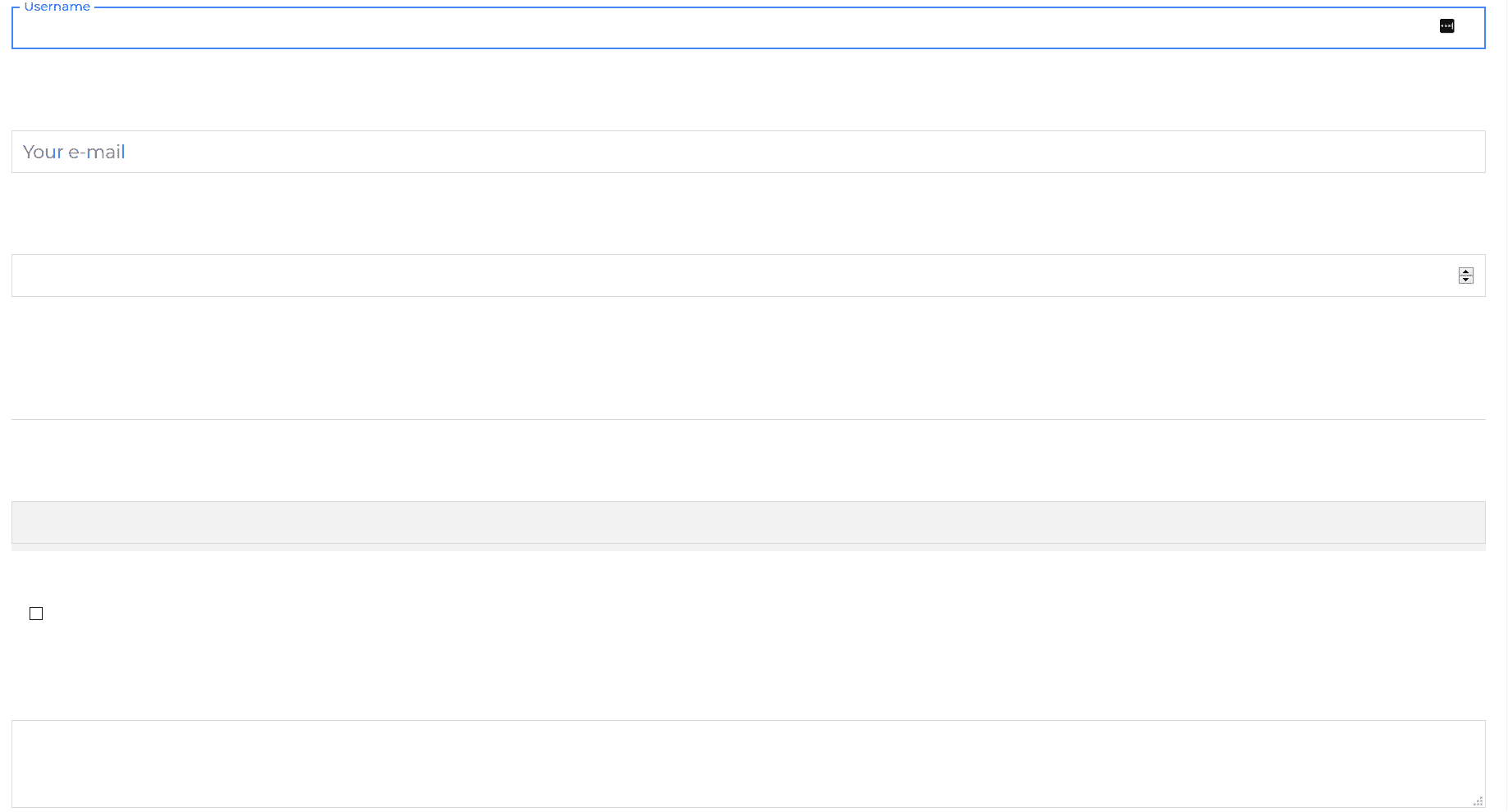
Default Input example.
html
<CDBInput id="username" label="Username"></CDBInput><CDBInput hint="Your e-mail" type="email"></CDBInput><CDBInput type="number"></CDBInput><CDBInput [material]=true type="text"></CDBInput><CDBInput [background]=true type="text"></CDBInput><CDBInput type="checkbox"></CDBInput><CDBInput class="mt-5" type="textarea"></CDBInput>
Input Sizing

html
<CDBInput label="Your e-mail" type="email" size="sm"></CDBInput><CDBInput type="number" label="Your Number" size="lg"></CDBInput>
Input with icons

html
<CDBInput label="Username" type="text" icon="user"></CDBInput><CDBInput label="Password" type="password" icon="bell"></CDBInput>
Input with MD

html
<CDBInput [material]=true label="Your e-mail" type="email"></CDBInput><CDBInput [material]=true type="number" label="Your Number"></CDBInput>
Placeholder

html
<CDBInput hint="Your e-mail" type="email"></CDBInput><CDBInput type="number" hint="Your Number"></CDBInput>
Disabled Inputs

html
<CDBInput hint="Your e-mail" type="email" [disabled]=true></CDBInput><CDBInput type="number" hint="Your Number" [disabled]=true></CDBInput>
Textarea
html
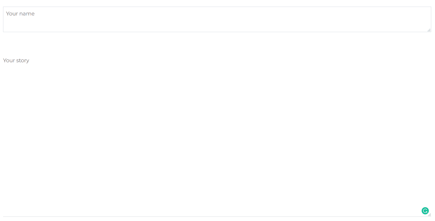
<CDBInput label="Your name" type="textarea"></CDBInput><CDBInput label="Your story" type="textarea" [material]=true rows=20 cols=30></CDBInput>
Background

html
<CDBInput hint="Your e-mail" type="email" [background]=true></CDBInput><CDBInput type="number" hint="Your Number" [background]=true></CDBInput>
API
Here in this section you will find information about required modules and available inputs, outputs, methods and events of this component.
Contrast Input Bootstrap Modules used
import {InputModule } from 'cdbangular';
API Reference: Contrast Input Inputs
The table below shows the possible input of the Input component.
| Name | Type | Default | Description | Example |
|---|---|---|---|---|
| class | String | Adds custom classes | class="myClass" | |
| containerClass | String | Adds custom class to wrapping div | containerClass="wrapper" | |
| error | String | Sets the error message for the labels data-error attribute | error="Ouch!" | |
| hint | String | Sets the placeholder for the Input | hint="Placeholder" | |
| value | Number, Boolean or String | The value of the input element (use with the controlled input) | value="I am controlled" onChange={this.handleChange} | |
| material | Boolean | false | Changes component styles for material theme | material=true |
| valueDefault | Number or String | The default value of the input (use with the uncontrolled input) | valueDefault="I am uncontrolled" | |
| id | String | Required! Set the id of the input element | id="myId" | |
| label | String | Add label to the component; you can attach jsx elements (f.e. links) | label="My custom input" | |
| labelClass | String | Add custom class to label | labelClass="My custom label class" | |
| labelId | String | Sets custom id to label | labelId="myId" | |
| size | String | lg | Changes size of the component; available lg and sm | size="lg" |
| success | String | Sets the success message for the labels data-success attribute | success="Great!" | |
| type | String | text | The type of the input element | type="checkbox" |
| inputRef | Object or function | Allows to attach Angular Ref to the input component; accepts only Callback Ref | inputRef={ref => this.myRef = ref } | |
| icon | String | Adds font awesome icon | icon="caret-right" | |
| iconBrand | String | Use this property to set brand icon (fab) | icon="twitter" iconBrand=true | |
| iconLight | String | Use this property to set light icon (fal) | icon="twitter" iconLight=true | |
| iconRegular | String | Use this property to set regular icon (far) | icon="twitter" iconRegular=true | |
| iconClass | String | Adds custom classes to icon element | icon="caret-right" iconClass="my-class" | |
| disable | Boolean | false | Disables Input component | disabled=true |
| group | Boolean | false | Add .form-group class to the wrapping div | error=true |
| filled | Boolean | false | Add filled-in style to checkbox/radio button | type="checkbox" filled=true |
| validate | Boolean | false | Adds .validate class to the Input component | validate=true |
| gap | Boolean | false | Creates gap inside checkbox/radio button | type="checkbox" gap=true |