Pagination
Pagination
Angular Bootstrap Pagination is a component used to indicate existence of a series of related content across multiple pages and enables navigation across them.
We use a large block of connected links for our pagination, making links hard to miss and easily scalable—all while providing large hit areas. Pagination is built with list HTML elements so screen readers can announce the number of available links. We use a wrapping <nav> element to identify it as a navigation section to screen readers and other assistive technologies.
Examples
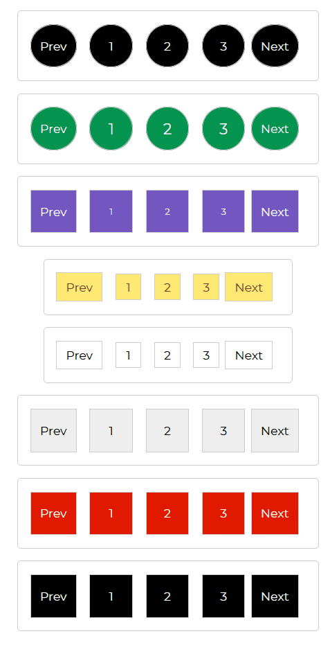
Default Pagination example.
html
<CDBPagination circle=true><CDBPagelink>Prev</CDBPagelink><CDBPageitem>1</CDBPageitem><CDBPageitem>2</CDBPageitem><CDBPageitem>3</CDBPageitem><CDBPagelink>Next</CDBPagelink></CDBPagination><CDBPagination circle='true' size="big" color="success"><CDBPagelink>Prev</CDBPagelink><CDBPageitem>1</CDBPageitem><CDBPageitem>2</CDBPageitem><CDBPageitem>3</CDBPageitem><CDBPagelink>Next</CDBPagelink></CDBPagination><CDBPagination size="small" color="secondary"><CDBPagelink>Prev</CDBPagelink><CDBPageitem>1</CDBPageitem><CDBPageitem>2</CDBPageitem><CDBPageitem>3</CDBPageitem><CDBPagelink>Next</CDBPagelink></CDBPagination><CDBPagination color="warning" sm=true><CDBPagelink>Prev</CDBPagelink><CDBPageitem>1</CDBPageitem><CDBPageitem>2</CDBPageitem><CDBPageitem>3</CDBPageitem><CDBPagelink>Next</CDBPagelink></CDBPagination><CDBPagination color="white" sm=true><CDBPagelink>Prev</CDBPagelink><CDBPageitem>1</CDBPageitem><CDBPageitem>2</CDBPageitem><CDBPageitem>3</CDBPageitem><CDBPagelink>Next</CDBPagelink></CDBPagination><CDBPagination color="light"><CDBPagelink>Prev</CDBPagelink><CDBPageitem>1</CDBPageitem><CDBPageitem>2</CDBPageitem><CDBPageitem>3</CDBPageitem><CDBPagelink>Next</CDBPagelink></CDBPagination><CDBPagination color="danger"><CDBPagelink>Prev</CDBPagelink><CDBPageitem>1</CDBPageitem><CDBPageitem>2</CDBPageitem><CDBPageitem>3</CDBPageitem><CDBPagelink>Next</CDBPagelink></CDBPagination><CDBPagination><CDBPagelink>Prev</CDBPagelink><CDBPageitem>1</CDBPageitem><CDBPageitem>2</CDBPageitem><CDBPageitem>3</CDBPageitem><CDBPagelink>Next</CDBPagelink></CDBPagination>
API
Here in this section you will find information about required modules and available inputs, outputs, methods and events of this component.
Contrast Pagination Bootstrap Modules used
import {PaginationModule } from 'cdbangular';
API Reference: Contrast Pagination Inputs
The table below shows the possible input of the Pagination component.
| Name | Type | Default | Description | Example |
|---|---|---|---|---|
| class | String | Adds custom classes | Adds custom classes | class="myClass" |
| size | String | Changes size of pagination component. Choose from lg and sm | size="sm" | |
| sm | Boolean | false | Changes the size of pagination component to sm | sm=true |
| circle | Boolean | false | Changes the shape of pagination component to circular | circle=true |
| color | String | dark | Changes default pagination buttons color; available values: [blue, red, teal, dark-grey, dark, blue-grey, amber, purple] | color="red" |
API Reference: Contrast Pagination Item Properties
The table below shows the configuration options of the CDBPageItem component.
| Name | Type | Default | Description | Example |
|---|---|---|---|---|
| class | String | Adds custom classes | class="myClass" | |
| disable | Boolean | false | Disables item from being clicked | disabled=true |
| active | Boolean | false | Sets active state of the button | active=true |
API Reference: Contrast Pagination Link Properties
The table below shows the configuration options of the CDBPageLink component.
| Name | Type | Default | Description | Example |
|---|---|---|---|---|
| className | String | Adds custom classes | class="myClass" | |
| disable | Boolean | false | Disables item from being clicked | disabled=true |
| active | Boolean | false | Sets active state of the button | active=true |