Notification
Notification
Angular Bootstrap Push notifications to your visitors with a toast, a lightweight and easily customizable alert message.
Toasts are lightweight notifications designed to mimic the push notifications that have been popularized by mobile and desktop operating systems. They’re built with flexbox, so they’re easy to align and position.
Custom Notification Types
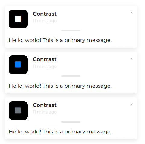
html
<CDBNotification [show]=true [fade]=true [autohide]='2' title="Contrast" message="Hello, world! This is a primary message."text="11 mins ago" ></CDBNotification><CDBNotification [show]=true [fade]=true iconClassName="text-primary" title="Contrast"message="Hello, world! This is a primary message." text="11 mins ago" ></CDBNotification><CDBNotification [show]=true [fade]=true iconClassName="text-secondary" title="Contrast"message="Hello, world! This is a primary message." text="11 mins ago" ></CDBNotification>
Notification with Hidden Message
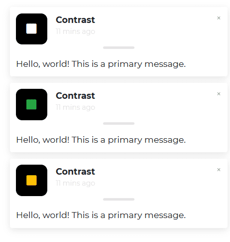
html
<CDBNotification [show]=true [fade]=true [hideMessages]=true [autohide]='5' title="Contrast"message="Hello, world! This is a primary message." text="11 mins ago" ></CDBNotification><CDBNotification [show]=true [fade]=true [hideMessages]=true iconClassName="text-success" title="Contrast"message="Hello, world! This is a primary message." text="11 mins ago" ></CDBNotification><CDBNotification [show]=true [fade]=true [hideMessages]=true iconClassName="text-warning" title="Contrast"message="Hello, world! This is a primary message." text="11 mins ago" ></CDBNotification>
Change Color of Icon Box
Simply add the disabled boolean attribute to CDBNotification
html
<CDBNotification [show]=true [fade]=true color="success" title="Contrast" message="Hello, world! This is a primary message."text="11 mins ago" ></CDBNotification><CDBNotification [show]=true [fade]=true color="danger" title="Contrast" message="Hello, world! This is a primary message."text="11 mins ago" ></CDBNotification><CDBNotification [show]=true [fade]=true color="secondary" title="Contrast" message="Hello, world! This is a primary message."text="11 mins ago" ></CDBNotification><CDBNotification [show]=true [fade]=true color="primary" title="Contrast" message="Hello, world! This is a primary message."text="11 mins ago" ></CDBNotification>
Notification with Icons
Simply add the disabled boolean attribute to CDBNotification
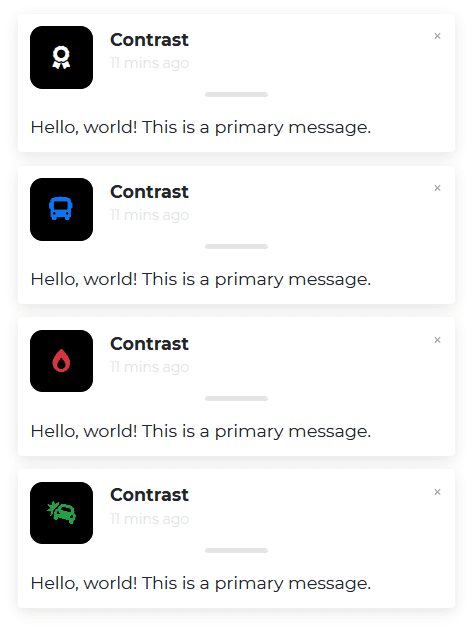
html
<CDBNotification [show]=true [fade]=true title="Contrast" icon="award" message="Hello, world! This is a primary message."text="11 mins ago" ></CDBNotification><CDBNotification [show]=true [fade]=true iconClassName="text-primary" title="Contrast" icon="bus"message="Hello, world! This is a primary message." text="11 mins ago" ></CDBNotification><CDBNotification [show]=true [fade]=true iconClassName="text-danger" title="Contrast" icon="burn"message="Hello, world! This is a primary message." text="11 mins ago" ></CDBNotification><CDBNotification [show]=true [fade]=true iconClassName="text-success" icon="car-crash" title="Contrast"message="Hello, world! This is a primary message." text="11 mins ago" ></CDBNotification>
Positioning
Simply add the disabled boolean attribute to CDBNotification
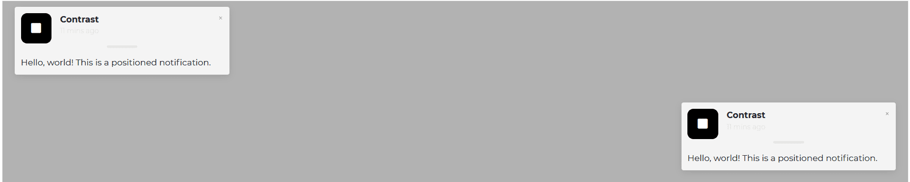
html
<CDBNotification [show]=true [fade]=true title="Contrast" message="Hello, world! This is a positioned notification."text="11 mins ago" position="top-left" ></CDBNotification><CDBNotification [show]=true [fade]=true title="Contrast" message="Hello, world! This is a positioned notification."text="11 mins ago" position="bottom-right" ></CDBNotification>
API
Here in this section you will find information about required modules and available inputs, outputs, methods and events of this component.
Contrast Notification Bootstrap Modules used
import {NotificationModule } from 'cdbangular';
API Reference: Contrast Notification Inputs
The table below shows the possible input of the Notification component.
| Name | Type | Default | Description | Example |
|---|---|---|---|---|
| bodyClassName | String | Adds custom className to the body section of notification component | bodyClassName="p-5 font-weight-bold" | |
| bodyColor | String | Set color to the body section of notification component | bodyColor="black" | |
| Class | String | Adds custom classes to the wrapper | Class="stylish-color-dark" | |
| closeClassName | String | text-dark | Adds custom classes to the Close button | closeClassName="blue-grey-text" |
| fade | Boolean | false | Adds a fade effect when you close the notification | fade=true |
| hideMessages | Boolean | false | Hides messages in the component | hideMessages=true |
| autohide | Number | Sets time in ms when box hide. 0 = infinity | autoHide=3000 | |
| icon | String | square | Sets a custom icon | icon="bell" |
| iconClassName | String | Adds custom classes to the Icon | iconClassName="green-text" | |
| message | String | Sets message of the notification | message="Hello there! This is a toast message" | |
| position | String | One of top-right, top-center, top-left, bottom-right, bottom-center, bottom-left | position="top-right" | |
| show | Boolean | true | Shows your component. If you do not use this setting, your component will exist, but it will be hidden. | show=false |
| text | String | Sets text of the notification | text="11 minutes ago" | |
| title | String | Set header text of the notification | title="Someone sent you an email" | |
| titleClassName | String | Adds custom classes to the title text | titleClassName="elegant-color-dark-white-text" | |
| titleColor | String | Sets the color of the title | titleColor="white" |