EditableTable
EditableTable
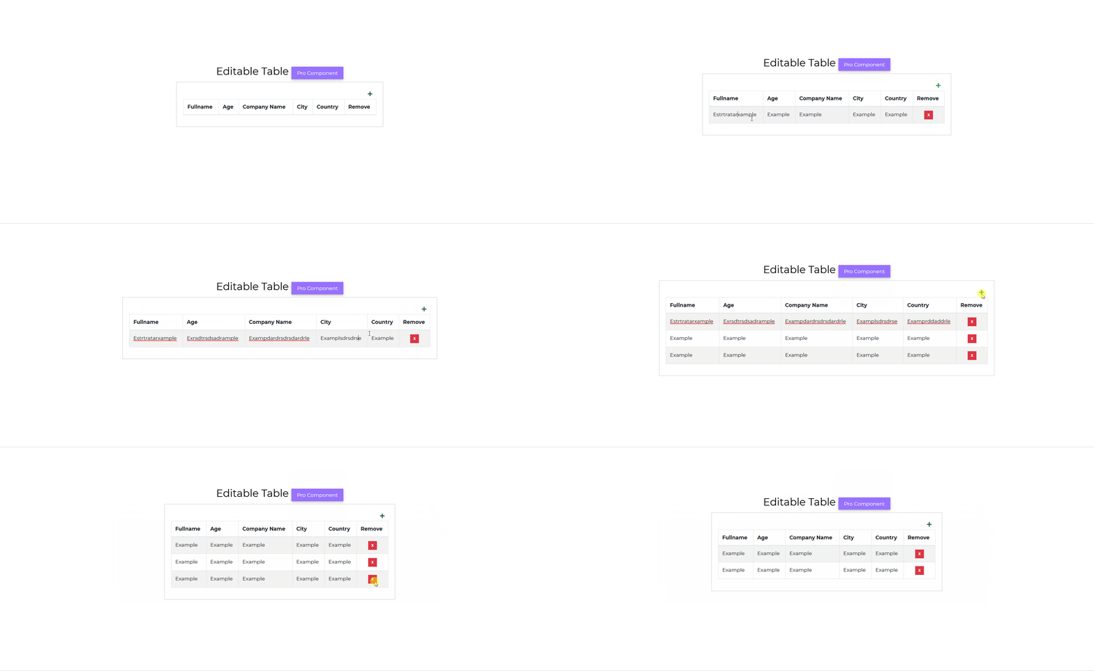
With React Editable Bootstrap Table, you can add and remove rows and change text and information within cells. In-place editing on your website - based on JavaScript - is now easier and quicker.
Examples
Pro ComponentDefault EditableTable example.
import React from "react";import { CDBEditableTable, CDBCard, CDBCardBody, CDBContainer } from "cdbreact";export const EditableTable = () => {const columns = ["Fullname", "Age", "Company Name", "City", "Country"];const data = [["Guerra Cortez", 45, "Insectus", "San Francisco", "USA"],["Elisa Gallagher", 31, "Portica", "London", "United Kingdom"],["Aurelia Vega", 30, "Deepends", "Madrid", "Spain"],["Guadalupe House", 26, "Isotronic", "Berlin", "Germany"]];return (<CDBContainer><CDBCard><CDBCardBody><CDBEditableTable striped bordered data={data} columns={columns}/></CDBCardBody></CDBCard></CDBContainer>);};
API
In this section you will find advanced information about the EditableTable component. You will find out which modules are required, what are the possibilities of configuring the component, and what events and methods you can use to work with it.
Contrast EditableTable Import Statement
You need to import the Contrast EditableTable component first before using it.
import { CDBEditableTable } from "cdbreact";
API Reference: Contrast EditableTable Properties
The table below shows the configuration options of the CDBEditableTable component.
| Name | Type | Default | Description | Example |
|---|---|---|---|---|
| className | String | Adds custom classes | Adds custom classes | <CDBEditableTable className="myClass" ... /> |
| tag | String | div | Changes default input tag | <CDBEditableTable tag="input" ... /> |
| autoWidth | Boolean | false | Adds w-auto to the className | <CDBEditableTable autoWidth .../> |
| bordered | Boolean | false | Adds borders on all sides of the table and cells. | <CDBEditableTable bordered .../> |
| borderless | Boolean | false | Removes borders on all sides of the table and cells. | <CDBEditableTable borderless .../> |
| data | Array | Binds your data into the component. | <CDBEditableTable data = {['Aurelia Vega', 30, 'Depends']} .../> | |
| columns | Array | Specify headers and number of columns | <CDBEditableTable columns={['Person Name', 'Age', 'Company Name']} .../> | |
| hover | Boolean | false | Enables a hover state on table rows within a table body. | <CDBEditableTable hover .../> |
| responsive | Boolean | Makes table responsive across all viewports | <CDBEditableTable responsive .../> | |
| responsiveSm | Boolean | Makes table responsive up to the small breakpoint | <CDBEditableTable responsiveSm .../> | |
| responsiveMd | Boolean | Makes table responsive up to the medium breakpoint | <CDBEditableTable responsiveMd .../> | |
| responsiveLg | Boolean | Makes table responsive up to the large breakpoint | <CDBEditableTable responsiveLg .../> | |
| responsiveXl | Boolean | Makes table responsive up to the extra large breakpoint | <CDBEditableTable responsiveXl .../> | |
| hover | Boolean | false | Enables a hover state on table rows within a table body. | <CDBEditableTable hover .../> |
| small | Boolean | false | Makes tables more compact by cutting cell padding in half. | <CDBEditableTable small .../> |
| striped | Boolean | false | Adds zebra-striping to any table row within the table body. | <CDBEditableTable striped .../> |