Progress
Progress
Angular Bootstrap Progress bar is a component which displays progress of a process in which user is involved. Their color, shape, and animation can be customized.
If it takes too long for your website to load up, your user will be less stressed about it when he sees a simple progress bar. It means as much as “Everything is fine. The content you want to see will load in a few seconds”.
Circular Progress Color Variations
Default Progress example.

html
<CDBCircularProgress value=25 max=100 min=0 text="25%"></CDBCircularProgress><CDBCircularProgress value=50 max=100 min=0 text="50%" color="primary"></CDBCircularProgress><CDBCircularProgress value=95 max=100 min=0 color="secondary" text="95%"></CDBCircularProgress><CDBCircularProgress value=35 max=100 min=0 color="danger" text="35%"></CDBCircularProgress><CDBCircularProgress value=47 max=100 min=0 color="info" text="47%"></CDBCircularProgress><CDBCircularProgress value=100 max=100 min=0 color="success" text="100%"></CDBCircularProgress>
Circular Progress Size Variations
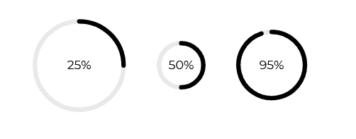
html
<CDBCircularProgress value=25 max=100 min=0 text="25%" size="lg"></CDBCircularProgress><CDBCircularProgress value=50 max=100 min=0 text="50%" size="sm"></CDBCircularProgress><CDBCircularProgress value=95 max=100 min=0 text="95%" size="md"></CDBCircularProgress>
Rect Progress Default

html
<CDBProgress wrapperStyle="" value=69 text="69%"></CDBProgress>
Rect Progress Color Variants
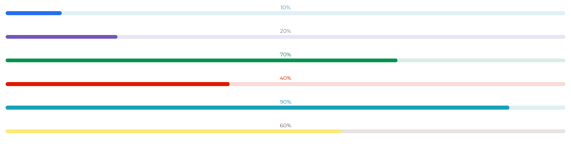
html
<div><CDBProgress value=10 text="10%" color="primary"></CDBProgress></div><div><CDBProgress value=20 text="20%" color="secondary"></CDBProgress></div><div><CDBProgress value=70 text="70%" color="success"></CDBProgress></div><div><CDBProgress value=40 text="40%" color="danger"></CDBProgress></div><div><CDBProgress value=90 text="90%" color="info"></CDBProgress></div><div><CDBProgress value=60 text="60%" color="warning"></CDBProgress></div>
Fixed Height

html
<div><CDBProgress value=45 color="dark" height=30 text="45%"></CDBProgress></div><div><CDBProgress value=60 color="success" height=20 text="60%"></CDBProgress></div><div><CDBProgress value=80 color="danger" height=40 text="80%"></CDBProgress></div>
API
Here in this section you will find information about required modules and available inputs, outputs, methods and events of this component.
Contrast Progress Bootstrap Modules used
import {ProgressModule } from 'cdbangular';
API Reference: Contrast Progress Inputs
The table below shows the possible input of the Progress component.
| Name | Type | Default | Description | Example |
|---|---|---|---|---|
| class | String | Adds custom classes to bar wrapper | class="myClass" | |
| barClass | String | Adds custom classes to colorful bar | barClass="myClass" | |
| colors | String | dark | Changes bar color; accepts CDB predefined color classes | colors="primary" |
| height | String | 10px | Sets custom height of the bar | height="50px" |
| max | Number | 100 | Sets maximum value of progress bar | max=200 |
| min | Number | 0 | Sets minimum value of progress bar | min=0 |
| value | Number | 0 | Sets current value of progress bar | value=40 |
| wrapperStyle | String | Sets additional inline styles for bar's wrapper | wrapperStyle="width: 50%" |