Multiselect
Multiselect
Multiselect is a form control, that after the click displays a collapsable list of multiple values which can be used in forms, menus or surveys.
Multiselect enables you to use ↑ and ↓ arrow keys to navigate through options and use ↵ key to select required option.
Basic Multiselect
Pro Component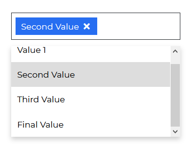
import React from "react";import { CDBMultiselect, CDBContainer } from "cdbreact";export const Multiselect = () => {// "showing" key:value pair optionalconst option = [{text: "Value 1",showing: true,},{text: "Second Value",showing: true,},{text: "Third Value",showing: true,},{text: "Final Value",showing: true,},];return (<CDBContainer><CDBMultiselect options={option} selected="Value" /></CDBContainer>);};
Multiselect with Search
Pro Component
import React from "react";import { CDBMultiselect, CDBContainer } from "cdbreact";export const Multiselect = () => {// "showing" key:value pair optionalconst option = [{text: "Value 1",showing: true,},{text: "Second Value",showing: true,},{text: "Third Value",showing: true,},{text: "Final Value",showing: true,},];return (<CDBContainer><CDBMultiselect color="secondary" search options={option} selected="Value" /></CDBContainer>);};
Multiselect with Submit Option
Pro Component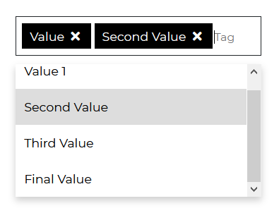
import React from "react";import { CDBMultiselect, CDBContainer } from "cdbreact";export const Multiselect = () => {// "showing" key:value pair optionalconst option = [{text: "Value 1",showing: true,},{text: "Second Value",showing: true,},{text: "Third Value",showing: true,},{text: "Final Value",showing: true,},];return (<CDBContainer><CDBMultiselect color="dark" submit options={option} selected="Value" /></CDBContainer>);};
Multiselect with Limited Options
Pro Component
import React from "react";import { CDBMultiselect, CDBContainer } from "cdbreact";export const Multiselect = () => {// "showing" key:value pair optionalconst option = [{text: "Value 1",showing: true,},{text: "Second Value",showing: true,},{text: "Third Value",showing: true,},{text: "Final Value",showing: true,},];return (<CDBContainer><CDBMultiselect color="danger" limitedOptions options={option} selected="Value" /></CDBContainer>);};
API
In this section you will find advanced information about the Multiselect component. You will find out which modules are required, what are the possibilities of configuring the component, and what events and methods you can use to work with it.
Contrast Multiselect Import Statement
You need to import the Contrast Multiselect component first before using it.
import { CDBMultiselect } from "cdbreact";
API Reference: Contrast Multiselect Properties
The table below shows the configuration options of the CDBMultiselect component.
| Name | Type | Default | Description | Example |
|---|---|---|---|---|
| className | String | Adds custom classes | Adds custom classes | <CDBMultiselect className="myClass" ... /> |
| tag | String | div | Changes default tag | <CDBMultiselect tag="div" ... /> |
| search | Boolean | false | Search element will appear as the first child of select. | <CDBMultiselect search .../> |
| color | String | primary | Sets colorful hover effect on select options. | <CDBMultiselect color="secondary" ... /> |
| options | array of objects | Sets options array as source of data. This property is used in alternative Select version. | <CDBMultiselect options={option} ... /> | |
| selected | String | Set default select text content. | <CDBMultiselect selected="choose_option" ... /> |