TimePicker
TimePicker
Angular Bootstrap material time picker is a component which uses a dialog to select a single time in hours:minutes format. The selected time is indicated by the filled circle at the end of the clock hand.
Examples
Default TimePicker example.
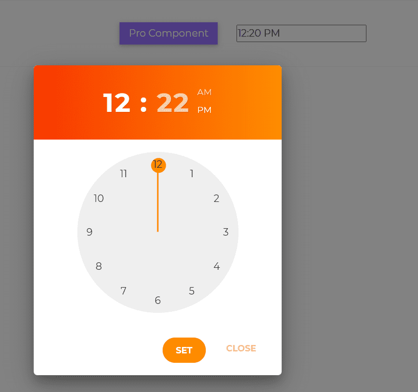
html
<CDBTimepicker placeholder="10:05 AM" theme="SoundCloud" colorPalette="dark"></CDBTimepicker>
API
Here in this section you will find information about required modules and available inputs, outputs, methods and events of this component.
Angular Bootstrap TimePicker Modules used
import {TimePickerModule } from 'cdbangular';
API Reference: Contrast TimePicker Inputs
The table below shows the possible input of the TimePicker component.
| Name | Type | Default | Description | Example |
|---|---|---|---|---|
| placeholder | String | Required! Sets placeholder for time indicator input | placeholder="placeholder" | |
| time | String | Sets the time | time="09:30:30 AM" | |
| class | String | Adds custom classes | Adds custom classes | class="myClass" |
| theme | String | Sets the theme of the time picker. Can be either material, classic or neomorphism | theme="classic" | |
| colorPalette | String | light | Changes the color palette of the time picker. Can be either light or dark | colorPalette="dark" |
| disable | Boolean | false | Disables TimePicker component | [disabled] = false |