Panel
Panel
Panels are the flexible and extensible content containers with multiple variants, which include a wide variety of content, contextual background colors, and powerful display options. Panels are similar to cards, but they don't include media.
Panel with Dropdown
Pro Component
Warren Briggs
Chicago
import React from "react";import { CDBPanel, CDBPanelTitle, CDBPanelText, CDBDropDown, CDBDropDownToggle, CDBDropDownMenu, CDBDropDownItem, CDBPane, CDBIcon, CDBPaneImage, CDBContainer } from "cdbreact";const Panel = () => {return (<CDBContainer><CDBPanel><CDBPane><CDBPaneImage size="md" src="https://media.istockphoto.com/photos/beautiful-woman-wearing-brown-curly-hairstyle-picture-id495006065?s=170x170" /><div className="ml-3"><CDBPanelTitle>Warren Briggs</CDBPanelTitle><CDBPanelText small>Chicago</CDBPanelText></div><CDBDropDown className="ml-auto"><CDBDropDownToggle color="white"><CDBIcon className="text-muted" fas icon="ellipsis-h" /></CDBDropDownToggle><CDBDropDownMenu><CDBDropDownItem disabled>Edit Profile</CDBDropDownItem><CDBDropDownItem divider /><CDBDropDownItem>Action 1</CDBDropDownItem><CDBDropDownItem>Action 2</CDBDropDownItem></CDBDropDownMenu></CDBDropDown></CDBPane><CDBPanelText className="my-3">Lorem ipsum dolor sit amet, consectetur adipisicing elit, sed do eiusmodtempor incididunt ut labore et dolore magna aliqua. Ut enim ad minim veniam,quis nostrud exercitation ullamco laboris nisi ut aliquip ex ea commodo</CDBPanelText><CDBPanelText small><CDBIcon far icon="thumbs-up"/>127 likes<CDBIcon className="ml-2" far icon="comment"/>54 comments</CDBPanelText></CDBPanel></CDBContainer>);};export default Panel;
Panel with Users
Pro Component


import React from "react";import { CDBPanel,CDBPanelTitle, CDBPanelText, CDBCardImage, CDBPaneImage, CDBContainer } from "cdbreact";const Panel = () => {return (<CDBContainer><CDBPanel className="p-0"><CDBCardImage className="img-fluid" src="/img/cardbg.png" /><div className="m-3"><CDBPanelTitle tag="h2" >Bristol</CDBPanelTitle><CDBPanelText className="my-3">Lorem ipsum dolor sit amet, consectetur adipisicing elit, sed do eiusmodtempor incididunt ut labore et dolore magna aliqua.</CDBPanelText><CDBPaneImage size="sm" src="/img/pane/pane1.png" /><CDBPaneImage size="sm" className="mx-2" src="/img/pane/pane2.png" /><CDBPaneImage size="sm" src="/img/pane/pane3.png" /></div></CDBPanel></CDBContainer>);};export default Panel;
Panel with Label

import React from "react";import { CDBPanel,CDBPanelTitle, CDBPanelText, CDBBadge, CDBIcon, CDBPaneImage, CDBContainer } from "cdbreact";const Panel = () => {return (<CDBContainer><CDBPanel><CDBBadge color="dark" flat>Label 1</CDBBadge><CDBBadge color="warning" className="mx-1" flat>Label 2</CDBBadge><CDBBadge color="danger" flat>Label 3</CDBBadge><div className="mt-3 d-flex align-items-center"><CDBPanelTitle tag="h3" >Moon Fever</CDBPanelTitle><CDBIcon className="ml-auto" fas icon="chart-line"/></div><CDBPanelText className="my-3">Lorem ipsum dolor sit amet, consectetur adipisicing elit, sed do eiusmodtempor incididunt</CDBPanelText><CDBPaneImage size="sm" src="/img/pane/pane1.png" /><CDBPaneImage size="sm" src="/img/pane/pane2.png" /></CDBPanel></CDBContainer>);};export default Panel;
Pane List
My Messages
Warren Briggs
Cooking
5mins Ago
Lu Chen
Cooking
5mins Ago

Sam
Cooking
5mins Ago
Danny
Cooking
5mins Ago
Lilah Loselev
Cooking
5mins Ago
import React from "react";import { CDBPanel,CDBPanelTitle, CDBPanelText, CDBDropDown, CDBDropDownToggle, CDBDropDownMenu, CDBDropDownItem, CDBPane, CDBIcon, CDBPaneImage, CDBContainer } from "cdbreact";const Panel = () => {return (<CDBContainer><CDBPanel style={{width:"320px"}}><CDBPane><CDBPanelText muted>My Messages</CDBPanelText><CDBDropDown className="ml-auto"><CDBDropDownToggle color="white"><CDBIcon className="text-muted" fas icon="ellipsis-h"/></CDBDropDownToggle><CDBDropDownMenu><CDBDropDownItem disabled>Edit Profile</CDBDropDownItem><CDBDropDownItem divider /><CDBDropDownItem>Action 1</CDBDropDownItem><CDBDropDownItem>Action 2</CDBDropDownItem></CDBDropDownMenu></CDBDropDown></CDBPane><CDBPane className="mt-4"><CDBPaneImage size="md" src="https://media.istockphoto.com/photos/beautiful-woman-wearing-brown-curly-hairstyle-picture-id495006065?s=170x170" /><div className="ml-3"><CDBPanelTitle>Warren Briggs</CDBPanelTitle><CDBPanelText small>Cooking</CDBPanelText></div><CDBPanelText muted small className="ml-auto">5mins ago</CDBPanelText></CDBPane><CDBPane className="mt-4"><CDBPaneImage size="md" src="/img/pane/pane1.png"><CDBPanelTitle>Lu Chen</CDBPanelTitle><CDBPanelText small>I'll call you back</CDBPanelText></div><CDBPanelText muted small className="ml-auto">27mins ago</CDBPanelText></CDBPane><CDBPane className="mt-4"><CDBPaneImage size="md" src="/img/pane/pane2.png"><CDBPanelTitle>Sam</CDBPanelTitle><CDBPanelText small>See you at school</CDBPanelText></div><CDBPanelText muted small className="ml-auto">active</CDBPanelText></CDBPane><CDBPane className="mt-4"><CDBPaneImage size="md" src="/img/pane/pane3.png" /><div className="ml-3"><CDBPanelTitle >Danny</CDBPanelTitle><CDBPanelText small>Yeah</CDBPanelText></div><CDBPanelText muted small className="ml-auto">busy</CDBPanelText></CDBPane><CDBPane className="mt-4"><CDBPaneImage size="md" src="/img/pane/pane4.png" /><div className="ml-3"><CDBPanelTitle>Lilah Loselev</CDBPanelTitle><CDBPanelText small>Okay sir</CDBPanelText></div><CDBPanelText muted small className="ml-auto">1hr ago</CDBPanelText></CDBPane></CDBPanel></CDBContainer>);};export default Panel;
Panel with Progress
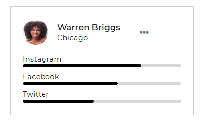
import React from "react";import { CDBPanel,CDBPanelTitle, CDBPanelText, CDBDropDown, CDBDropDownToggle, CDBDropDownMenu, CDBDropDownItem, CDBProgress, CDBPane, CDBIcon, CDBPaneImage, CDBContainer } from "cdbreact";const Panel = () => {return (<CDBContainer><CDBPanel><CDBPane><CDBPaneImage size="md" src="https://media.istockphoto.com/photos/beautiful-woman-wearing-brown-curly-hairstyle-picture-id495006065?s=170x170" /><div className="ml-3"><CDBPanelTitle>Warren Briggs</CDBPanelTitle><CDBPanelText small>Chicago</CDBPanelText></div><CDBDropDown className="ml-auto"><CDBDropDownToggle color="white"><CDBIcon className="text-muted" fas icon="ellipsis-h" /></CDBDropDownToggle><CDBDropDownMenu><CDBDropDownItem disabled>Edit Profile</CDBDropDownItem><CDBDropDownItem divider /><CDBDropDownItem>Action 1</CDBDropDownItem><CDBDropDownItem>Action 2</CDBDropDownItem></CDBDropDownMenu></CDBDropDown></CDBPane><CDBPanelText className="mt-3" small>Instagram</CDBPanelText><CDBProgress value={75} height={5}/><CDBPanelText className="mt-2" small>Facebook</CDBPanelText><CDBProgress value={60} height={5}/><CDBPanelText className="mt-2" small>Twitter</CDBPanelText><CDBProgress value={45} height={5}/></CDBPanel></CDBContainer>);};export default Panel;
API
In this section you will find advanced information about the Panel component. You will find out which modules are required, what are the possibilities of configuring the component, and what events and methods you can use to work with it.
Contrast Panel Import Statement
You need to import the Contrast Panel component first before using it.
import { CDBPanel, CDBPanelTitle, CDBPanelText } from "cdbreact";
API Reference: Contrast Panel Properties
The table below shows the configuration options of the CDBPanel component.
| Name | Type | Default | Description | Example |
|---|---|---|---|---|
| className | String | Adds custom classes | <CDBPanel className="myClass" ... /> | |
| tag | String | div | Changes default tag | <CDBPanel tag="input" ... /> |
| color | string | Sets the color of the panel | <CDBPanel color="#000" .../> |
API Reference: Contrast Panel Title Properties
The table below shows the configuration options of the CDBPanelTitle component.
| Name | Type | Default | Description | Example |
|---|---|---|---|---|
| className | String | Adds custom classes | <CDBPanelTitle className="myClass" ... /> | |
| tag | String | h6 | Changes default tag | <CDBPanelTitle tag="h5" ... /> |
API Reference: Contrast Panel Text Properties
The table below shows the configuration options of the CDBPanelText component.
| Name | Type | Default | Description | Example |
|---|---|---|---|---|
| className | String | Adds custom classes | <CDBPanelText className="myClass" ... /> | |
| tag | String | p | Changes default tag | <CDBPanelText tag="p" ... /> |
| small | Boolean | false | Uses html small as component's tag | <CDBPanelText small ... /> |
| muted | Boolean | false | Mutes the text color | <CDBPanelText muted ... /> |