Alert
Alert
Angular Bootstrap Alert can be used to provide feedback messages to users after specific actions are carried out.
Examples
Contrast Alerts are available for any length of text, as well as an optional dismiss button. For proper styling, use one of the contextual props (e.g., color="success"). For inline dismissal, use the dismiss prop.
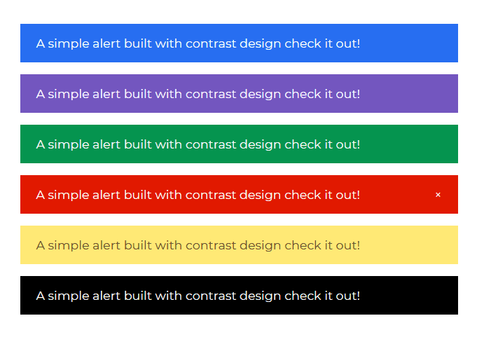
Typescript
import { Component, OnInit } from `@angular/core`;@Component({selector: `app-alert`,templateUrl: `./alert.component.html`,styleUrls: [`./alert.component.scss`]})export class AlertComponent implements OnInit {constructor() { }ngOnInit(): void {}}
HTML
<CDBAlert color="primary">A simple alert built with contrast design check it out!</CDBAlert><CDBAlert color="secondary">A simple alert built with contrast design check it out!</CDBAlert><CDBAlert color="success">A simple alert built with contrast design check it out!</CDBAlert><CDBAlert color="danger" [dismiss]=true>A simple alert built with contrast design check it out!</CDBAlert><CDBAlert color="warning">A simple alert built with contrast design check it out!</CDBAlert><CDBAlert color="dark">A simple alert built with contrast design check it out!</CDBAlert>
API
Here in this section you will find information about required modules and available inputs, outputs, methods and events of the Alert component.
Contrast Alert Bootstrap Modules used
import {AlertModule } from 'cdbangular';
API Reference: Contrast Alert Bootstrap Inputs
The table below shows the possible inputs of the Alert component.
| Name | Type | Default | Description | Example |
|---|---|---|---|---|
| class | String | Adds custom classes | [class]="myClass" | |
| color | String | primary | Sets color of the alert. Choose one of these: primary, secondary, success, danger, warning, info, light, dark | [color]="primary" |
| dismiss | Boolean | false | Shows a dismiss button | [dismiss]=true |